Alternate voting buttons for Question2Answer
Published: 3 May 2012 • Tags: q2a, php, css
Here is an alternate style of voting buttons for popular open source Q&A platform Question2Answer. The default setup is fine – besides the bad image quality – but this setup gives the voting a little more focus.
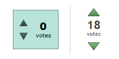
Default Q2A style on left; my arrangement on right.
Because the buttons are split up, implementing this requires some changes to an advanced theme.
There’s an introduction to advanced themes on the Q2A site, but at its most simplest level you just create a file named qa-theme.php in your current theme folder, with this class:
<?php

class qa_html_theme extends qa_html_theme_base
{
	// override functions here
}
Now we override a few functions to change the HTML output of Q2A. We actually only override the voting_inner_html function, and split the call to vote_buttons into two separate functions. Here is the whole code:
function voting_inner_html($post)
{
	$this->vote_button_up($post);
	$this->vote_count($post);
	$this->vote_button_down($post);
	$this->vote_clear();
}

function vote_button_up($post)
{
	$this->output('<div class="qa-vote-buttons '.(($post['vote_view']=='updown') ? 'qa-vote-buttons-updown' : 'qa-vote-buttons-net').'">');

	switch (@$post['vote_state'])
	{
		case 'voted_down':
		case 'voted_down_disabled':
			break;
		case 'voted_up':
			$this->post_hover_button($post, 'vote_up_tags', '+', 'qa-vote-one-button qa-voted-up');
			break;
		case 'voted_up_disabled':
			$this->post_disabled_button($post, 'vote_up_tags', '', 'qa-vote-one-button qa-vote-up');
			break;
		case 'enabled':
			$this->post_hover_button($post, 'vote_up_tags', '+', 'qa-vote-first-button qa-vote-up');
			break;
		default:
			$this->post_disabled_button($post, 'vote_up_tags', '', 'qa-vote-first-button qa-vote-up');
			break;
	}

	$this->output('</div>');
}

function vote_button_down($post)
{
	$this->output('<div class="qa-vote-buttons '.(($post['vote_view']=='updown') ? 'qa-vote-buttons-updown' : 'qa-vote-buttons-net').'">');

	switch (@$post['vote_state'])
	{
		case 'voted_up':
		case 'voted_up_disabled':
			break;
		case 'voted_down':
			$this->post_hover_button($post, 'vote_down_tags', '-', 'qa-vote-one-button qa-voted-down');
			break;
		case 'voted_down_disabled':
			$this->post_disabled_button($post, 'vote_down_tags', '', 'qa-vote-one-button qa-vote-down');
			break;
		case 'enabled':
			$this->post_hover_button($post, 'vote_down_tags', '-', 'qa-vote-second-button qa-vote-down');
			break;
		default:
			$this->post_disabled_button($post, 'vote_down_tags', '', 'qa-vote-second-button qa-vote-down');
			break;
	}

	$this->output('</div>');
}
Next, we need to apply some better CSS. I am using some wider voting buttons from this image I created:

The CSS changes the background image and size of the arrows and surrounding boxes. It also hides the arrows from the questions lists – it doesn’t really make sense to vote on a question before you have read it, and this voting layout doesn’t fit very well into the page anyway. The following CSS can simply be copy-pasted to the bottom of your qa-styles.css in your current theme:
/* Modified voting buttons */
.qa-voting, .qa-a-count { float: left; width: 56px; height: 42px; padding: 8px 0; color: #444; text-align: center; text-shadow: 1px 1px 1px #fff; }
.qa-voting { overflow: visible; }
.qa-voting .qa-vote-msg { position: absolute; z-index: 100; top: 80px; width: 420px; background-color: #d3ecc5; border: 1px solid #bad0ae; color: #222; padding: 8px; text-align: center; }
.qa-vote-buttons { float: none; width: auto; height: 20px; padding: 0; }
.qa-vote-first-button, .qa-vote-second-button, .qa-vote-one-button { display: block; width: 24px; height: 16px; background: transparent url("q2a-buttons-wide.png"); border: 0; color: transparent; font-size: 1px; cursor: pointer; }
.qa-vote-first-button, .qa-voted-up-button, .qa-voted-up-hover { margin: 0 auto 4px; }
.qa-vote-second-button, .qa-voted-down-button, .qa-voted-down-hover { margin: 10px auto 0; }
.qa-vote-up-button { background-position: 0 0; }
.qa-vote-up-disabled { background-position: 0 -64px; }
.qa-vote-up-hover, .qa-vote-up-button:hover { background-position: 0 -16px; }
.qa-vote-down-button { background-position: -24px 0; }
.qa-vote-down-disabled { background-position: -24px -64px; }
.qa-vote-down-hover, .qa-vote-down-button:hover { background-position: -24px -16px; }
.qa-voted-up-button { background-position: 0 -32px; }
.qa-voted-up-hover, .qa-voted-up-button:hover { background-position: 0 -48px; }
.qa-voted-down-button { background-position: -24px -32px; }
.qa-voted-down-hover, .qa-voted-down-button:hover { background-position: -24px -48px; }
.qa-vote-count { float: none; }
.qa-netvote-count { display: block; width: auto; }
.qa-netvote-count-data { display: block; padding-top: 1px; font-size: 24px; font-weight: bold; line-height: 1; }
.qa-netvote-count-pad { display: block; font-size: 12px; }
.qa-upvote-count, .qa-downvote-count { width: 48px; height: 27px; position: relative; top: -4px; display: block; }
.qa-upvote-count-data, .qa-downvote-count-data { font-size: 18px; font-weight: bold; display: inline; }
.qa-upvote-count-pad, .qa-downvote-count-pad { font-size: 9px; display: none; }
.qa-q-view .qa-voting { background-color: transparent; border: 0; }
.qa-a-list-item .qa-voting { background: transparent; border: 0; height: auto; }
.qa-q-list-item .qa-vote-buttons, .qa-q-list-item .qa-vote-buttons-net { display: none; }
.qa-a-count-data { display: block; font-size: 24px; font-weight: bold; line-height: 1; }
.qa-a-count-pad { display: block; font-size: 12px; }
This voting style is also incorporated into a new theme I have recently published, which will be the base for most of the themes I create in future. You can find said theme here on Github (click “ZIP” in the top left to get the entire repository).
That’s it! I hope this post was helpful; let me know in the comments if you have any problems.